These boards are colour puzzles first and shape puzzles second, which is fine until two of the colours are indistinguishable to you. That is common, it is not a skill problem, and there is more that can be done about it than most players realise.
The problem, stated plainly
Red-green colour vision deficiency affects roughly one in twelve men and about one in two hundred women. Jewel boards typically use six colours, and red and green are almost always two of them, sitting next to each other on a dark background at high saturation.
For an affected player the board is not harder in an interesting way. It is partially unreadable, and no amount of practice fixes it, because the information is not reaching the eye in the first place.
What the games already provide
More than people expect, and it is rarely mentioned in the tutorial.
- Shape on the gem. Better designs give each colour its own silhouette: a round one, a teardrop, a hexagon. Where this exists, the colour becomes redundant information and the board is fully playable without it. It is worth checking for in the screenshots before installing.
- Symbols or pips. Some titles add a small mark to each gem type. Usually optional, usually buried in accessibility settings, and usually left off by default.
- A colourblind mode. Common in the larger titles. It normally shifts the palette rather than adding shapes, which helps some people and not others; it costs nothing to try both ways.
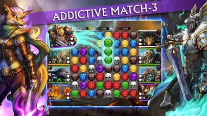
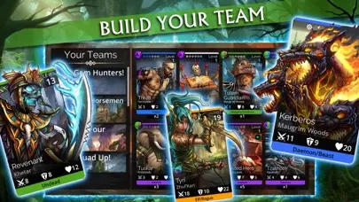
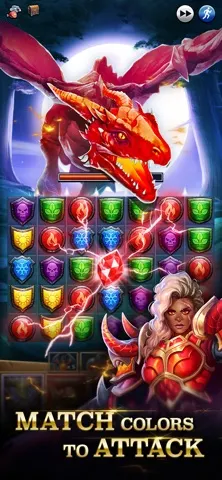
Before installing a gem game, open the store screenshots and ask one question: could I still tell these tiles apart in greyscale? If the answer is yes, the design uses shape as well as colour, and it will stay playable for far more people.
Settings on the phone itself
Both platforms carry system-level colour filters that work across every app, including games that offer nothing of their own.
- iOS. Settings, then Accessibility, then Display and Text Size, then Colour Filters. Choose the filter matching your type of deficiency and adjust the intensity slider; the change applies everywhere.
- Android. Settings, then Accessibility, then Colour and motion, then Colour correction. The same idea, with deuteranomaly, protanomaly and tritanomaly options.
These filters are not perfect on saturated game art and can make some screens look strange, but on a board where two tiles were previously identical they frequently make the difference between playable and not.
Contrast, brightness and the rest of us
Even with ordinary colour vision, these boards are demanding. They are usually designed on a bright studio monitor and played on a phone outdoors, or at night with the screen dimmed to the point where dark tiles merge.
Two habits help more than they should. Turn off automatic brightness while playing, because a board that shifts brightness mid-level forces your eyes to re-adapt every few seconds. And if the game offers a lighter background theme, take it; dark backgrounds make saturated colours vibrate against each other and that is genuinely tiring over a long session.
Sizes, spacing and mis-taps
A large share of mistakes on these boards are not misjudgements but mis-taps: the intended tile and its neighbour are four millimetres apart on glass. Games with an eight-by-eight grid on a small phone are asking a lot, and the answer is either a larger device or accepting a slower, more deliberate pace.
Where a game offers a zoom or a larger board layout, it is worth using even though it shows less of the board at once. Seeing less of the board accurately beats seeing all of it approximately.
Judging a game before you commit
Since these settings vary enormously between titles, the practical order is: check the store screenshots for shape cues, install, look for an accessibility or display section in the settings before playing seriously, and if neither exists, apply the system colour filter. If the board is still unreadable after all three, that game was not built for your eyes and there are others that were. That is a reasonable conclusion to reach quickly rather than after forty levels of frustration.